Personal Finance / FinTech
PaisaSense: From financial information to financial action
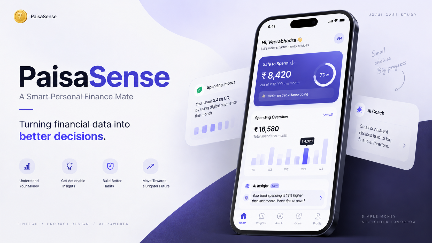
A Smart Personal Finance Mate a concept that moves users from financial information to financial understanding to financial action, instead of simply displaying more data.
- Role
- UI/UX Designer
- Team
- Solo
- Duration
- 1 week
- Status
- Completed
- Tools
- Figma,FigJam and AI tools
Outcome: A personal-finance prototype with original Maze testing and a revised home-screen hierarchy. Quick Actions now sits directly below Safe to Spend. The revised layout has not yet been retested; improved usability is not claimed.
Problem context
What was actually going wrong
What problem existed
Digital-finance products provide users with large amounts of financial information, but there is still a gap between having financial data and understanding what to do with it.
Who experienced it
Young Indian adults aged 18–40 with very different financial situations — students, early-career professionals, working adults, freelancers and business owners.
Why it mattered
Seeing financial data is not the same as understanding financial behaviour. Users still ask: why did I spend more, what should I pay attention to, am I moving toward my goals, what should I do next?
What was known
Research sample: 7 participants (qualitative interviews, Bengaluru). Existing budgeting, personal-finance and payment platforms were studied.
What still needs validation
Whether the proposed guidance model measurably improves understanding, decision confidence or financial outcomes. Metric to be validated
Research
Understanding the gap between data and action
Research sample: 7 participants (qualitative interviews, Bengaluru). Existing budgeting, personal-finance and payment platforms were studied.
Research lens
How personal finance evolved from manual tracking to digital financial tools.
- Personal finance evolved from manual money management toward digital banking, payment platforms, budgeting tools and financial dashboards.
- Digital products now provide large amounts of financial information.
- But seeing financial data ≠ understanding financial behaviour. Users may still ask why they spent more, what to pay attention to, whether they are moving toward their goals, and what to do next.
Research lens
Who the users are, where they are, and when the problem appears.
- Target: young Indian adults, age 18–40 — students, early-career professionals, working adults, freelancers and business owners.
- Context: Indian digital finance / FinTech. Research environment: Bengaluru.
- Device: primarily mobile. Digital comfort: users familiar with UPI, mobile banking and digital payments.
- Core problem location: after financial activity has happened, when users need to understand their spending and decide what to do next.
Research lens
The forces and friction between seeing financial data and taking action.
- Core journey: Financial Activity → Transaction Data → Categorization → Aggregation → Pattern Detection → Insight → User Decision → Action → Feedback.
- Top user tasks: understand current financial behaviour, identify what needs attention, decide and take an appropriate financial action.
- Friction: too much information, manual effort, lack of context, difficult spending patterns, reactive behaviour, complex financial terminology.
- Core simplification: Data → Interpretation → Decision becomes Understand → Decide → Act → Improve.
Research lens
How emotion, trust, and technology interact during financial decisions.
- Emotional starting point: overwhelmed → uncertain → reactive.
- Key question: 'What does this number actually mean for me?'
- Trust issues: financial privacy, AI trust, understanding how information is used and how recommendations are generated.
- Desired emotional state: clarity → confidence → control. Desired feeling: 'I understand what's happening with my money, and I know what I can do next.'
Research lens
How users behave today and what behaviour the product should encourage.
- Existing habit loop: Spend → Notice later → Review transactions → Realize a problem → Try to correct it → Repeat.
- Desired behavioural shift: from reactive financial management to proactive financial awareness and decision-making.
- Feedback loop: Financial activity → Insight → User action → New financial activity → New information → Better future insights.
Research lens
The evidence, measurements, and metrics.
- Research sample: 7 participants (qualitative interviews, Bengaluru).
- Usability testing: 10–15 minutes per session, 2 key tasks evaluated.
- Original Maze task completion: 87.5% on Money Ritual (8 responses), 66.7% on Spending Impact (6 responses). These results precede the layout revision.
- Time / effort saved: Metric to be validated
- Error reduction: Metric to be validated
- Confidence change: Metric to be validated
- User quotes: To be added (no quotes are reproduced here without a verified source).
- Business impact: Metric to be validated
Design engineering
The process, as it actually ran
Steps marked as pending were not part of this project. They are shown so the gaps stay visible.
Research — completed
Researched the Indian digital-finance context; qualitative interviews with 7 participants in Bengaluru.
Competitor analysis — completed
Studied existing budgeting, personal-finance and payment platforms; identified behavioural gaps.
Synthesis — completed
Research synthesized into themes and insights.
Persona — completed
Persona created from interview themes.
Empathy map — completed
Empathy map created from interview themes.
Journey map — completed
Journey mapped across spending, budgeting and saving moments.
Product mechanics — completed
Safe-to-Spend, AI Coach, Spending Impact, AI Spending Summary, Goals, Challenges.
Task flow — completed
Flows for the core Understand → Decide → Act → Improve loop.
Information architecture — completed
IA defined for the mobile experience.
Wireframes — completed
Wireframes for the core flows.
Final interface — completed
Prototype-level final experience.
Usability testing — completed
Original Maze results: Money Ritual — 8 responses; Spending Impact — 6 responses. Results are detailed below, separately from the 7 qualitative interviews.
Design iteration — completed
Moved Quick Actions directly below Safe to Spend after the Money Ritual discoverability finding. Revised layout not yet retested.
STAR story
Situation, Task, Action, Result
Situation
Digital-finance products provide users with large amounts of financial information, but there is still a gap between having financial data and understanding what to do with it.
Task
Design a personal finance experience that helps users move from simply tracking transactions to understanding financial behaviour and making better decisions.
Action
- Researched the Indian digital-finance context and studied existing budgeting, personal-finance and payment platforms.
- Identified behavioural gaps between seeing financial data and acting on it.
- Structured the product around Financial awareness → Decision support → Action → Improvement.
- Designed the experience around Understand → Decide → Act → Improve, exploring Safe-to-Spend, AI Coach, Spending Impact, AI Spending Summary, Goals and Challenges.
Result
PaisaSense became a concept focused on transforming raw financial activity into understandable insights and actionable decisions rather than simply displaying more financial data. Because validated business metrics are unavailable, none are claimed. Measured impact: Metric to be validated
Usability Testing
Original Maze results
Baseline results from the original layout. The revised layout has not yet been retested.
Money Ritual
- Responses
- 8
- Success rate
- 87.5%
- Drop-off
- 12.5%
- Average duration
- 105.3 seconds
- Average ease rating
- 8.8/10
Spending Impact
- Responses
- 6
- Success rate
- 66.7%
- Drop-off
- 33.3%
- Average duration
- 40.9 seconds
Overall app usefulness: 4.7/5 from 6 responses.
Maze response counts are separate from the 7 qualitative interview participants. They are not combined into a unique participant total. Time saved, error reduction and confidence change were not measured.
Key Findings
Key Findings
A missed action, not a completed task
- During Money Ritual testing, one participant explored the navigation tabs but did not scroll down to find the Money Ritual button in the More Actions section. The participant could not complete the task.
- This observation identified a discoverability issue with the placement of Money Ritual in the original home-screen layout.
Design Iteration
Design Iteration
What changed after feedback, and the reasoning behind each change.
- I moved Quick Actions directly below the Safe to Spend card to improve the discoverability of Money Ritual, Add Expense, Challenges and Add Goals.
- The revised home-screen hierarchy brings important actions closer to the top while preserving Financial Overview and the other dashboard sections.
- This change responds to the observed Money Ritual discoverability issue. Its effect on usability remains unvalidated because the revised layout has not yet been retested.
Before & after
What changed, and why
Before
Money Ritual was in More Actions further down the home screen. One participant explored the navigation tabs but did not scroll down to find it and could not complete the task.
REVISED LAYOUT
Quick Actions is directly below Safe to Spend, bringing Money Ritual, Add Expense, Challenges and Add Goals closer to the top. Financial Overview and the other dashboard sections are preserved.
- What changed
- Moved Quick Actions above Financial Overview, directly below Safe to Spend.
- Why it changed
- Make important actions more discoverable in response to the Money Ritual observation.
- Supporting evidence
- The revised layout has not yet been retested. No measured before/after improvement is claimed.
Current Outcome
Current Outcome
Design revised. Usability not yet revalidated.
- The home-screen hierarchy has been revised, with Quick Actions directly below Safe to Spend.
- The revised layout has not yet been retested. Improved usability or discoverability has not been demonstrated.
- Original Maze results describe the tested layout only. No production, business or financial outcomes are claimed.
Final screens
The interface
Existing prototype screens. The Home screenshot shows the original layout, not the revised Quick Actions placement.
Next Steps
Retest before claiming improvement
Planned validation — these checks have not yet been carried out.
- Retest the revised layout in Maze, observing whether participants find Quick Actions and complete Money Ritual without prompting.
- Compare task completion, drop-off, average duration and ease ratings with the original results. Collect new evidence before claiming improved usability.
- Check the discoverability of Add Expense, Challenges and Add Goals while preserving access to Financial Overview and other dashboard sections.
What this project taught me
- People do not struggle to see their money; they struggle to interpret it.
- The gap in financial products is between having data and knowing what to do with it — guidance is the missing layer.
- A concept is only as strong as the evidence behind it — the next step is validating the metrics marked above.
Next project
DayZy AI