Skip to content
Product DesignerFinTech focus

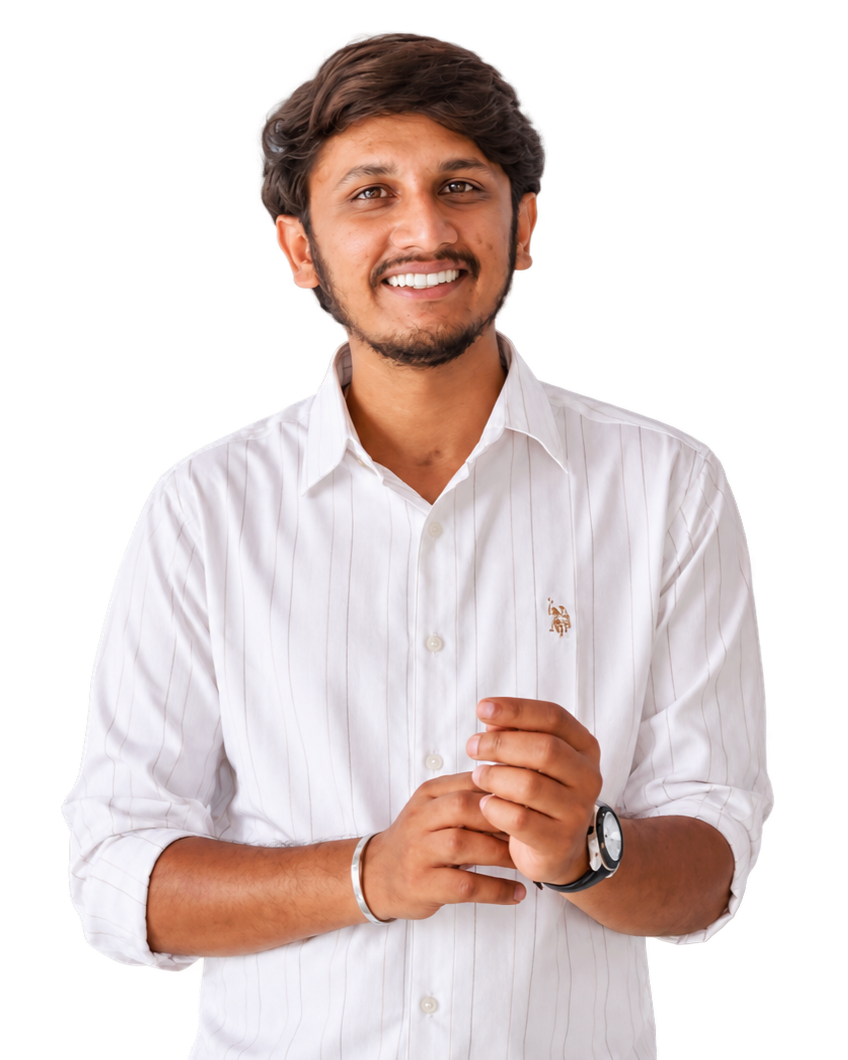
Veerabhadra Nayaka C K

I simplify complex financial products into clear, confident decisions.

Research-led product thinking and interface design across FinTech, SaaS and AI.

03
Case studies
02
Internships
Bengaluru
India
Explore Case Studies

Open to full-time roles

Veerabhadra Nayaka C K — UI/UX and Product Designer in Bengaluru

Personal story

How curiosity about technology turned into design

The short version: I kept trying to understand why some products feel obvious and others feel heavy — and eventually made that the job.

  1. 01

    Before

    Curiosity about technology came first. Long before the word 'UX' meant anything to me, I was pulling apart apps, games and meditation and personality-development products to see why some felt effortless and others did not. BCA gave me a technology foundation, but I was still looking for work that used both the analytical and creative side.

  2. 02

    Turning point

    UPSC preparation trained me to break large, messy problems into structured parts and reason through them. That habit, more than anything, is what led me into UX/UI.

  3. 03

    Design belief

    Good design is not about adding more. It is about removing confusion and making the user's next step obvious.

  4. 04

    Current mission

    Design is where technology, creativity, problem-solving and empathy meet. My mission is to help people navigate complex digital and financial experiences through simple, clear and meaningful design.

“Good design is not about adding more. It is about removing confusion and making the user's next step obvious.”

01

Start with the confusion, not the screen

The first job is to name what the user does not understand. The layout comes after that, not before it.

02

One clear answer per moment

A screen that answers one question well beats a dashboard that answers six poorly.

03

Make the next step obvious

Every screen should leave the user knowing exactly what to do next — without reading twice.

04

Show the evidence, and the gaps

Where a claim is not validated, I say so. Honest limits are more useful than confident guesses.

Skills & tools

What I work with

Listed as capability areas rather than proficiency scores.

Research & thinking

  • User interviews
  • Research synthesis
  • Personas & empathy maps
  • Journey mapping
  • Competitor analysis
  • Problem framing

Product & structure

  • Product mechanics
  • Task flows
  • Information architecture
  • Wireframing
  • Design systems
  • Prototyping

Interface

  • UI design
  • Interaction design
  • Responsive layout
  • Visual hierarchy
  • Accessibility basics
  • Design handoff

Tools

  • Figma
  • Wix Studio
  • Canva
  • Maze

Featured projects

Selected work

Three products across FinTech, SaaS and AI — each written up with its problem, process and honest evidence.

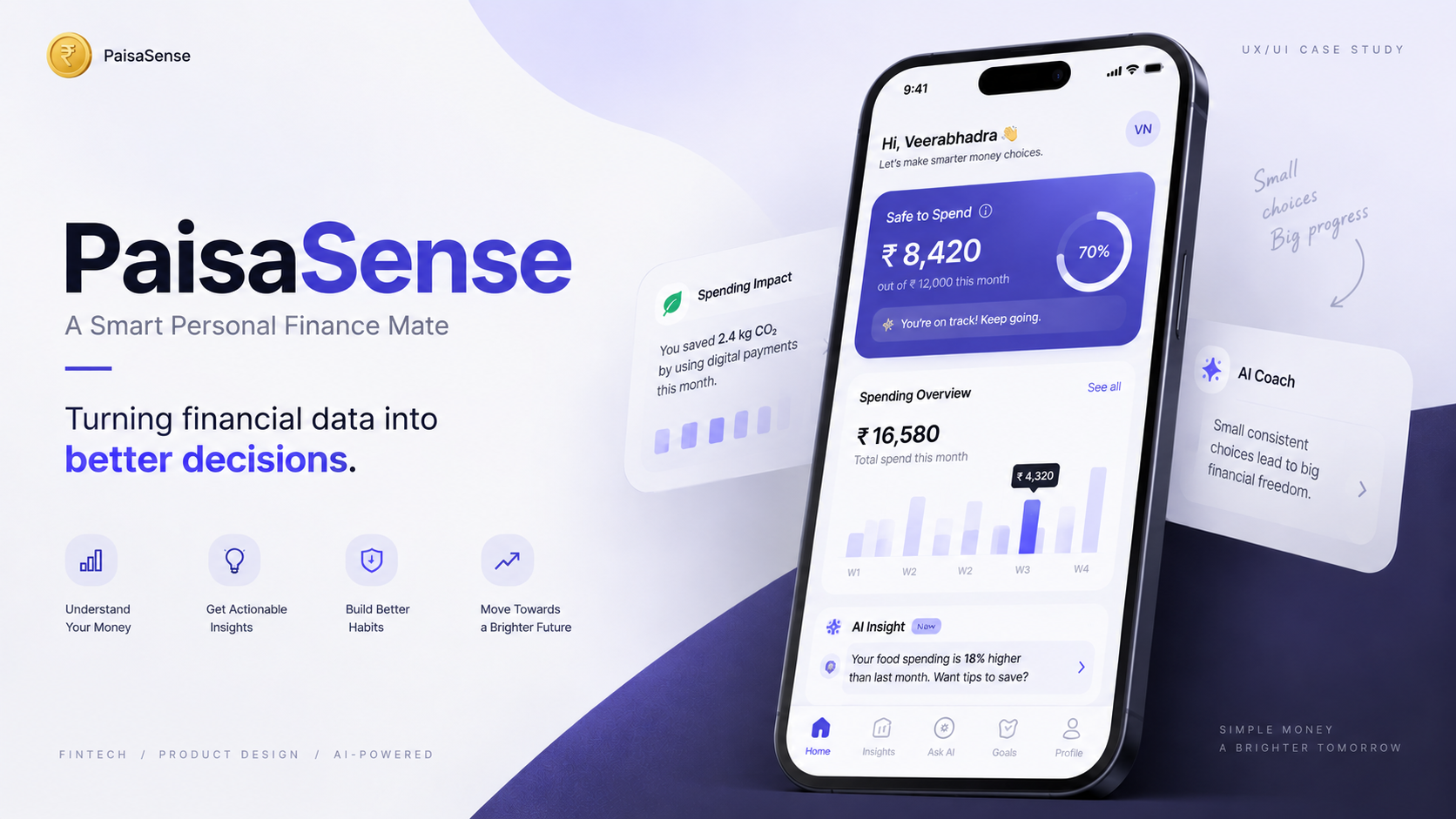
PaisaSense cover artwork — a smart personal finance mate concept

Personal Finance / FinTech

PaisaSense

Financial products already show users transactions, balances, categories, budgets, charts and reports. But seeing financial information does not necessarily mean understanding what it means or knowing what to do next.

Target user
Young Indian adults aged 18–40 — students, early-career professionals, working adults, freelancers and business owners.
My role
UI/UX Designer

Result (design outcome)Reframed the product around Understand → Decide → Act → Improve

FinTechMobileAIUPI
View case study
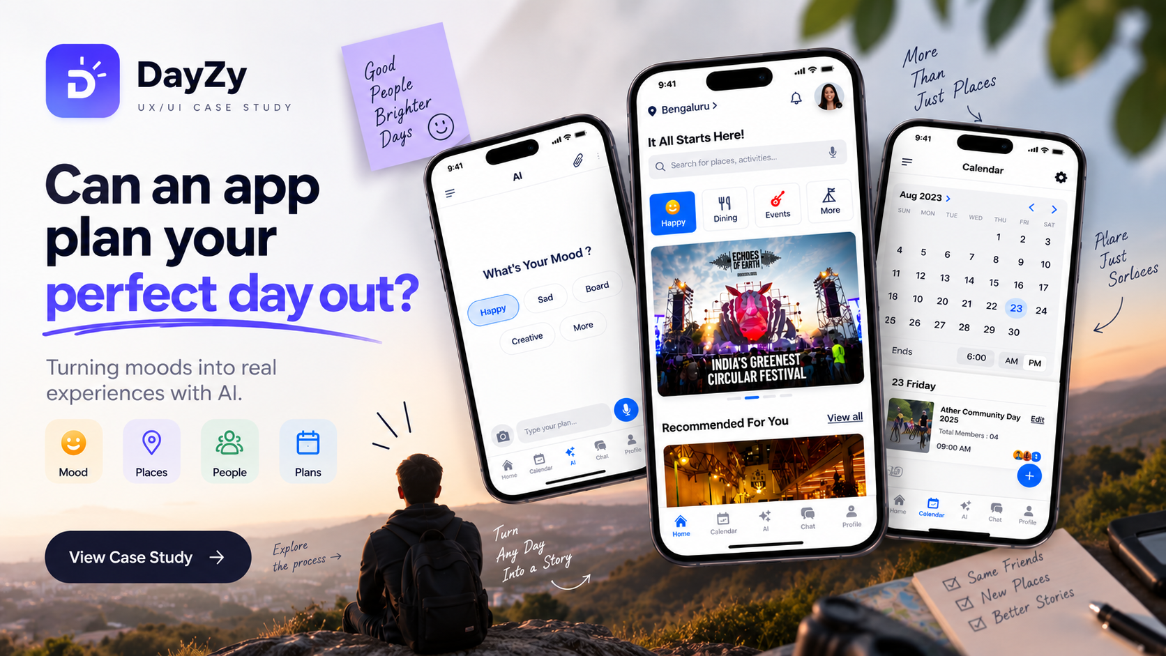
DayZy AI cover artwork — an AI day-out planning app concept

AI / Productivity

DayZy AI

Planning a day out means deciding what to do, choosing where to go, considering mood and group preferences, checking distance and travel, comparing options, gathering information and coordinating with others. The information exists across multiple platforms — the user becomes the connector between all those systems.

Target user
Indian users planning days out — college students, working professionals and non-working individuals; researched in Bangalore and across Karnataka.
My role
UI/UX Designer 

Result (design outcome)Replaced search-and-compare with a guided mood-to-plan flow

AIProductivityMobileSocial
View case study
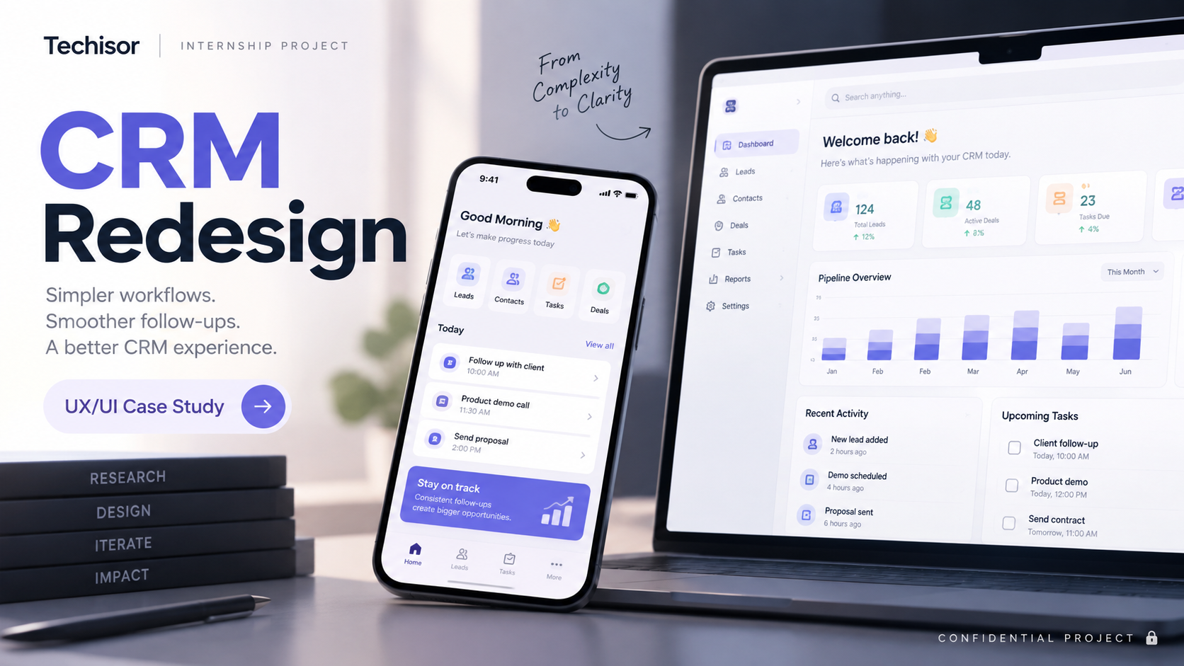
Togile CRM cover artwork — a SaaS CRM web application

CRM / SaaS

Togile CRM

Working with CRM information across leads, contacts, deals and reports was harder and less clear than it needed to be.

Target user
To be added
My role
UI/UX Designer

Result (design outcome)Reworked information hierarchy and action clarity in core CRM screens

SaaSCRMWeb appTeamInternship
View case study

Reference

What a team lead said

“It has been a pleasure watching you learn, grow, and take on new challenges with enthusiasm. I am really proud of you.”
Mahek — Team Lead, Brain Quest

Looking for a designer who starts with the problem?

I'm open to UI/UX and Product Design roles, and to FinTech product collaborations.

Start a Conversation