CRM / SaaS
Togile CRM: Making everyday CRM workflows easier to follow
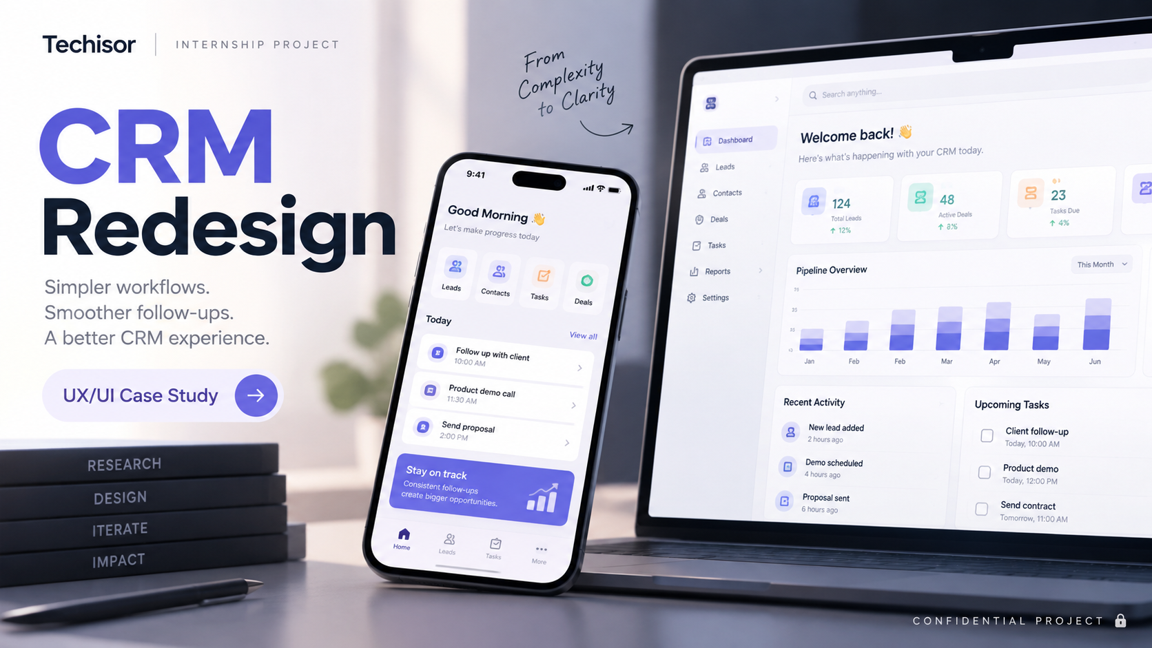
A learning and product-design experience from my internship at Techisor Pvt. Ltd., Bangalore: improving a CRM product covering leads, contacts, deals and reports. Confidential work — shared with abstracted placeholders only.
- Role
- UI/UX Designer
- Team
- Team
- Duration
- Dec 2025 – Feb 2026 (internship)
- Status
- Completed · internship project
- Tools
- Figma, FigJam, ChatGPT
Outcome: Contributed to improving the product experience during the internship. Quantitative outcomes are not invented here. Measured impact: Metric to be validated
Problem context
What was actually going wrong
What problem existed
During the internship, the team worked on a CRM product involving leads, contacts, deals and reports.
Who experienced it
To be added
Why it mattered
Important workflows needed to be easier and clearer for users.
What was known
Existing workflows and usability problems were reviewed as part of the internship work.
What still needs validation
Metric to be validated
What I worked on
The work, without the confidential detail
01
Workflow understanding
learned how users worked with leads, contacts, deals and reports.
02
Problem identification
surfaced usability problems in the existing product experience.
03
Information structure
restructured how CRM information was presented.
04
Interface improvement
improved screens and designed interfaces.
05
Feedback
shared work with the team and gathered feedback.
06
Refinement
refined the experience based on that feedback.
Usability problems & fixes
01 — Too much information at once
Problem: Users had difficulty quickly identifying the most important information because multiple CRM details were presented with similar visual emphasis.
How I fixed it: I reorganised the information hierarchy by grouping related content, reducing visual competition and giving the most important information stronger emphasis. This made the interface easier to scan and helped users find key information faster.
02 — Unclear next action
Problem: Users were sometimes unsure what to do next because primary actions were not clearly differentiated from secondary options.
How I fixed it: I created a clearer primary and secondary action hierarchy and positioned key actions closer to the content they related to. This made the next step more obvious without relying on additional instructions.
This project contains confidential work. Detailed metrics and confidential product information are not publicly available; private company information, proprietary data, unreleased product information, internal screenshots and sensitive workflows are intentionally not shown.
Design engineering
The process, as it actually ran
Steps marked as pending were not part of this project. They are shown so the gaps stay visible.
Understanding existing workflows — completed
Reviewed how users worked with leads, contacts, deals and reports.
Identifying usability problems — completed
Surfaced friction in the existing product experience.
Information structuring — completed
Restructured how CRM information was presented.
Screen improvement & interface design — completed
Improved screens and designed interfaces.
User flows — completed
Worked through user flows for key workflows.
Refinement from feedback — completed
Refined the experience based on feedback.
Research artifacts — pending
To be added
Usability testing — pending
To be added
STAR story
Situation, Task, Action, Result
Situation
During my internship, I worked on improving a CRM product involving areas such as leads, contacts, deals and reports.
Task
Improve the experience of working with CRM information and make important workflows easier and clearer for users.
Action
- Understood existing workflows and identified usability problems.
- Structured information and improved screens.
- Designed interfaces and thought through user flows.
- Refined the experience based on feedback.
Result
I contributed to improving the product experience during my internship. Quantitative outcomes are not invented here. Metric to be validated
Research lens
Testing
What was tested, with whom, and what was and wasn't measured.
- Work was reviewed with the team during the internship and refined from that feedback.
- Formal usability testing results are confidential or not available, so no test numbers are shown.
Research lens
Iteration
What changed after feedback, and the reasoning behind each change.
- Grouped related CRM content and reduced competing visual emphasis so the important information stands out first.
- Separated primary from secondary actions and moved key actions next to the content they act on.
- Refined screens across review rounds with the product team.
Research lens
Impact
The honest outcome measured where it exists, marked as unvalidated where it doesn't.
- Redesigned dashboards, KPI cards, reports and mobile interfaces across 4 key areas.
- Reduced CRM navigation steps by ~20% through improved information hierarchy.
Before & after
What changed, and why
Before
The original deal view packed navigation, deal details, activity and related records into dense, evenly weighted panels. Several controls competed for attention and there was no single clear next action.
After
The redesign groups deal information, activity and actions into clear sections, calms the visual hierarchy, and emphasises one primary action, so a sales user can scan a deal and know what to do next.
- What changed
- Information structure and key workflow screens were reworked.
- Why it changed
- Usability problems identified while reviewing the existing product.
- Supporting evidence
- Impact to be validated.
Both screens are abstracted views using demo data only. Other redesigns from this internship, including the mobile screens, are confidential and are intentionally not shown.
Final screens
The interface
Key screens from the final design.
Learnings
What this project taught me
- In a team SaaS product, clarity often comes from restructuring information rather than redesigning visuals.
- Feedback loops with the team shortened the distance between a proposed screen and a workable one.
Next project
PaisaSense